How to draw plots and bar charts in Typst
Typst has no built-in chart function — you import a package. Use cetz-plot (on top of the cetz drawing library) for bar, pie and line charts, and lilaq for scientific plotting with multiple axes, contours or error bars.
A bar chart with cetz-plot
Data is an array of rows. label-key is the index of the column holding the category label, and value-key the column (or columns, for a clustered chart) holding the numbers.
#import "@preview/cetz:0.5.2": canvas, draw
#import "@preview/cetz-plot:0.1.4": chart

#let data = (
  ([Baseline], 0.81),
  ([\+ dropout], 0.87),
  ([Ours],      0.94),
)

#figure(
  canvas({
    draw.set-style(barchart: (bar-width: .6))
    chart.barchart(
      size: (9, auto),
      label-key: 0,
      value-key: 1,
      x-tick-step: 0.2,
      data,
    )
  }),
  caption: [Accuracy by configuration.],
) <fig:accuracy>

As @fig:accuracy shows, the gain is mostly from dropout.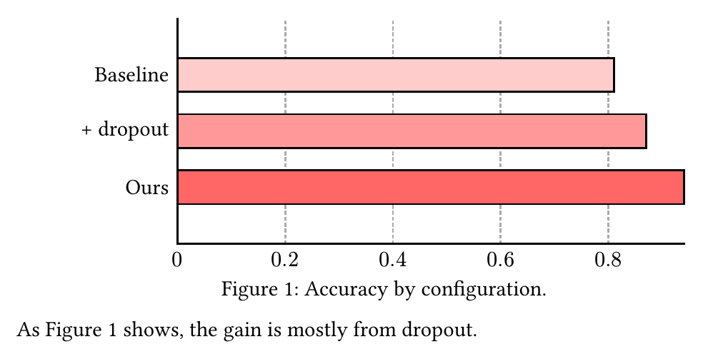
A line plot with cetz-plot
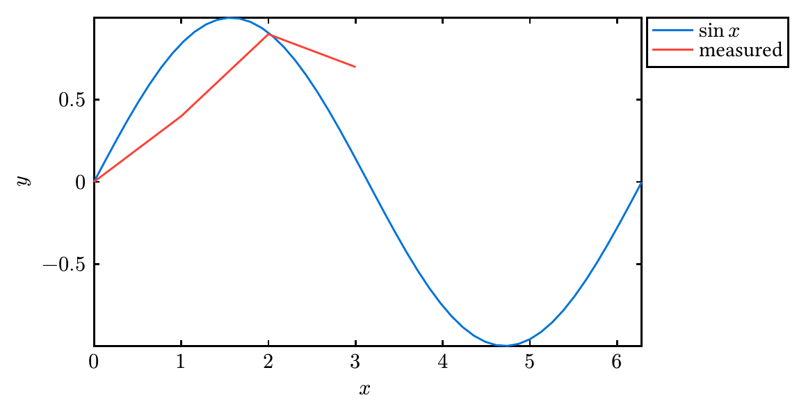
plot.add takes either a function of x over a domain, or an array of (x, y) pairs.
#import "@preview/cetz:0.5.2": canvas
#import "@preview/cetz-plot:0.1.4": plot

#canvas({
  plot.plot(
    size: (10, 6),
    x-tick-step: 1,
    y-tick-step: 0.5,
    {
      plot.add(x => calc.sin(x), domain: (0, 6.28), label: $ sin x $)
      plot.add(((0, 0), (1, 0.4), (2, 0.9), (3, 0.7)), label: [measured])
    },
  )
})
A scientific plot with lilaq
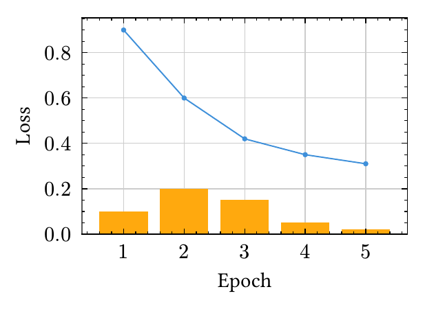
lilaq is the better fit when you need error bars, log axes, or several plots sharing a diagram. Everything lives inside lq.diagram.
#import "@preview/lilaq:0.6.0" as lq

#lq.diagram(
  xlabel: [Epoch],
  ylabel: [Loss],
  lq.plot((1, 2, 3, 4, 5), (0.9, 0.6, 0.42, 0.35, 0.31)),
  lq.bar((1, 2, 3, 4, 5), (0.1, 0.2, 0.15, 0.05, 0.02)),
)
Plotting a data file
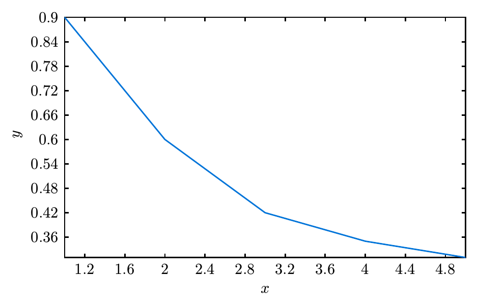
csv() reads a file at compile time, so the chart is regenerated whenever the data changes — no exporting images by hand.
#let rows = csv("results.csv")        // array of arrays of strings
#let points = rows.slice(1).map(r => (float(r.at(0)), float(r.at(1))))

#canvas({
  plot.plot(size: (10, 6), { plot.add(points) })
})
Related: inserting and positioning figures covers captions, placement, and referencing in more detail.
bar-width or an axis range is immediate rather than a rebuild-and-wait loop.Common questions
- How do I draw a bar chart in Typst?
- Import cetz and cetz-plot, then call chart.barchart inside a cetz canvas block with your data as an array of rows. Set label-key to the column holding the category name and value-key to the column or columns holding the values.
- Which plotting package should I use in Typst?
- cetz-plot for bar, pie and line charts and anything you also want to draw on, since it sits on the cetz drawing library. lilaq for scientific plotting where you need multiple axes, contours, colour meshes or error bars.
- How do I add a caption to a chart in Typst?
- Wrap the canvas or diagram in #figure(...) with a caption, and attach a label after it. The chart is then numbered as a figure and can be referenced with @fig:label like any image.
- Can I plot data from a CSV file in Typst?
- Yes. #let data = csv("data.csv") reads the file at compile time and gives you an array of rows you can map into the plotting function, so the chart updates when the data file changes.